Watch on YouTube for 1080p
Thursday 21 March 2013
Wednesday 20 March 2013
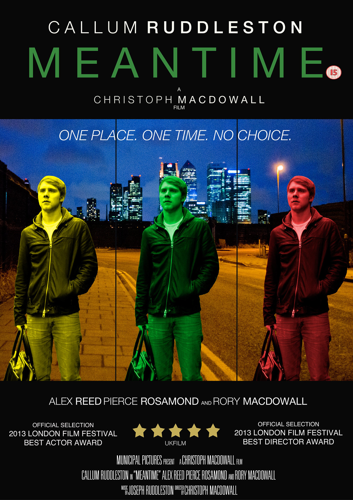
Poster Draft 2

This version has my final images, taken separately then put together through Photoshop, but the way in which I have modified them is subject to change.
Changes I am already making to this draft and will make are:
- I am going to change the central image of Callum to green rather than blue - blue does not seem to stand out enough from the background image, while green will do this but also go with the title colour.
- The overlapping of the images does not quite work to me, and so I will place them further apart.
- I will also add a tagline to the poster, as it is a key component of a theatrical poster which sells the film as a whole to the audience.
However, I am quite satisfied with the way in which both images have come out - my background image of the North Greenwich location with Canary Wharf is particularly strong so I may draw upon this location in my tagline, while the central image of Callum also blends quite well with it - something I am happy with as I was worried they would not go at all.
Thursday 7 March 2013
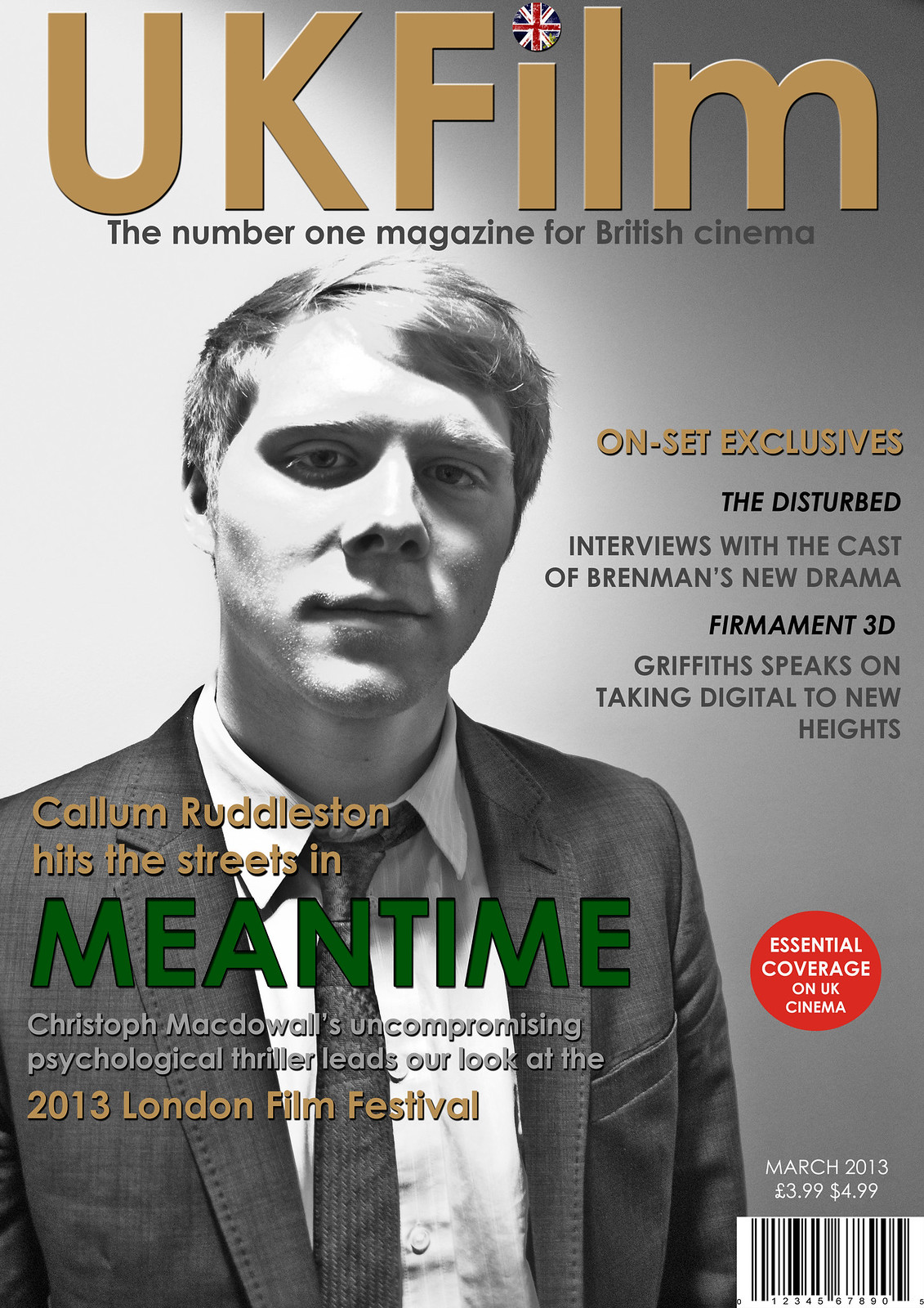
Magazine Draft 2

This is the second draft of my magazine, and possibly my final draft before the finished product as I feel that it has almost fully taken shape. Changes I have made from my first draft include:
- Inserting a picture of Callum done in black and white - I anticipated doing a picture in colour but in a strange way, I found this particular picture done in black and white to be more effective when contrasted against the colours in the graphics.
- I have added shadows to some of the graphics such as the title and the graphics that are laid over Callum in order to make them stand out and look more iconic.
- I have added a puff - 'essential coverage on UK cinema' - to give the magazine more flair.
- I have put a round British flag over the dot of the I, in order to make the title look more like an iconic logo.
Final changes I think that I will make include:
- Some final colour adjustment - the 'on set exclusives does not stand out enough for me so I will either change this colour or add shadow to it.
Monday 4 March 2013
Magazine Draft 1

This is the first draft for my magazine front cover - the only things missing from it at the moment are the image of Callum and information such as a barcode and the date of the magazine issue. However, some things that I have decided to work on, modify or add are:
- A logo for the 2013 London Film Festival - as the initials LFF have a certain ring to them, it is likely that I will base the logo around that motif.
- Develop the title 'UKFilm' into something more iconic that looks like a logo in its own right - one thing I am thinking of is embedding a union jack within the dot of the I - any larger British motif might detract from the understatement and classiness of the poster, but it is definitely necessary to add something to the title to make it stand out more.
- Puffs - I will add a small puff anchoring the magazine such as Sight and Sound's 'every new film reviewed', but I will also add puff images from other imaginary films or perhaps of film festivals/premieres etc.
- One thing I need to make sure of is that the colour of the title 'Meantime' is exactly the same as the colour that is also in the poster and trailer itself.
Depending on how the actual images I have taken look in the framework of this poster, other aspects of it may also need to be modified, mainly to do with the colours of the different graphics. I may also take more images denoting the 'mean' and tough quality the character develops - something I have already done is have Callum loosen his tie in the images in order to suggest the idea that this is a character who has gone off the rails.
Subscribe to:
Posts (Atom)